Weird Tableau: 1
Using Tableau to visualize comments made at public meetings
Hi, thanks for reading! This newsletter is all about using Tableau in unique ways (ie. not what you typically find in YouTube tutorials, blog posts, and community forums, etc…). I’m calling it Weird Tableau because I couldn’t think of anything better. I hope you find it interesting, entertaining, and all that other good stuff. And if you do, please share and subscribe!
This edition is about using Tableau to visualize public comments made to the The County of San Diego Independent Redistricting Commission (COSD IRC) during the 2021 COSD Board of Supervisors redistricting process. The end result is what you see below. Keep reading to learn how it came about.
Background
The County of San Diego Independent Redistricting Commission (COSD IRC) received thousands of comments from the public during the 2021 COSD Board of Supervisors redistricting process. Comments were submitted online and in person during public hearings. It was the IRC’s responsibility to draw new supervisorial districts that represented the interests of their local communities.
Challenge
My company (FLO Analytics) was tasked with helping the IRC synthesize the public comments and testimony. Specifically, we were asked to develop a web based tool to help the IRC understand the location and magnitude of themes and concerns being raised by the community.
How we did it
Step 1. Each week, each public comment (online and in person) was compiled into an excel spreadsheet and posted to a public location by County staff. Each week, I added all new comments to a copy of the file hosted on my company’s OneDrive. This version of the comment file contained six additional columns: Area Tag 1, Area Tag 2, Area Tag 3, Theme Tag 1, Theme Tag 2, Theme Tag 3.
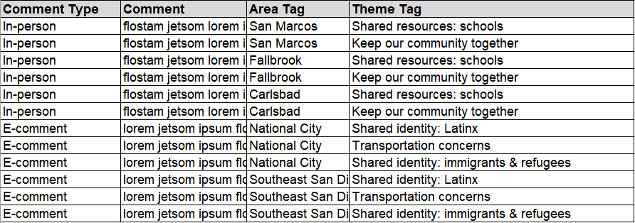
Step 2. After the new comments were added, two members of our communications team (shout outs to Claire Moerder and Sulley Schuster) read through them and assigned each comment up to three theme tags and three area tags. Many comments addressed multiple themes and were associated with more than one area. We didn’t want to strip the comments of nuance, but to maintain a semblance of “data sanity”, we limited the number of tags. Admittedly, three was an arbitrary choice but I think it worked out. The resulting spreadsheet looked something like this.
It was easy for Claire and Sulley to read the comments and assign tags with the data structured this way. Tableau (and technology in general), however does not like this data structure. It thinks this data structure is 💩. Which brings us too…
Step 3. Saddle up, it’s time to wrangle some data!!!!!

There are lots of ways to wrangle data (python, Alteryx, inefficiently written Excel macros1, etc…). For this exercise, I used Tableau Prep. One great thing (of many) about Tableau Prep, is that it comes with your Tableau Desktop license. Another great thing is that Tableau Prep simplifies many common data wranglin’ tasks. In this case I needed to pivot and standardize the area and theme tags. I started my workflow with two branches, one to pivot the area tags and one to pivot the theme tags. Then, I joined them back together using a record ID and added a few more general cleaning steps. The output was a nice and tidily structured .hyperfile.
Step 4. Ok, with our data wrangled it was dashboard building time. And with only one data source to worry about, this one was pretty straight forward.
4a) First up, the map. I plotted the Area tag, duplicated the field, converted it to a measure to get a count of each area, and place it on the size shelf.
4b) Next up was the word cloud. Word clouds are easy to make in Tableau2. All you do is drop the field that contains the words for your cloud (in this case, Theme Tag) onto “Text” in the marks shelf, change that dimension to a measure, change the default aggregation to from CountD to Count and boom goes the dynamite.
4C) A boring old table listing the actual public comments. huzzah.
4D) Lastly, I brought all three elements into the dashboard and set up a couple filter actions to allow the user to filter the comments by theme and area.
You can view and play around with the actual dashboard here: https://public.tableau.com/views/PublicCommentTestimonyTracker/CommentTracker?:language=en-US&:display_count=n&:origin=viz_share_link
One more thing
We used Tableau for other aspects of this and other local government redistricting projects. I plan to write about those in future posts, so stay tuned.
The End
Thanks so much for reading. Use that fancy pea-green button below to ask questions, state an opinion, or offer some enlightening wisdom. Even better, use it to tell me about your own unconventional Tableau dashboard. And don’t forget about the even fancier pea-green button below that, which you can click to subscribe. Or, the fanciest pea-green button at the very bottom to share this newsletter. (And if you know how to add more than one button to a row in Substack, use that first pea-green button to tell me how to do it).
This was my preferred approach before I learned how to use Tableau Prep and Alteryx.
I’ve had issues with how word clouds resize in response to filters in the past but it seems like Tableau has corrected this in more recent versions.


